
Picking the right color for your home is like choosing a favorite outfit. It is the first thing people see, and it tells the world a little bit about who lives inside.
I love how a fresh coat of paint can make an old house feel brand new. Here are some beautiful palettes to help you find a look that feels just like home.
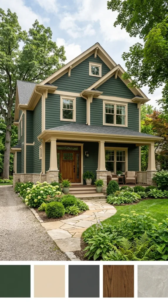
Forest Green with Natural Wood Accents
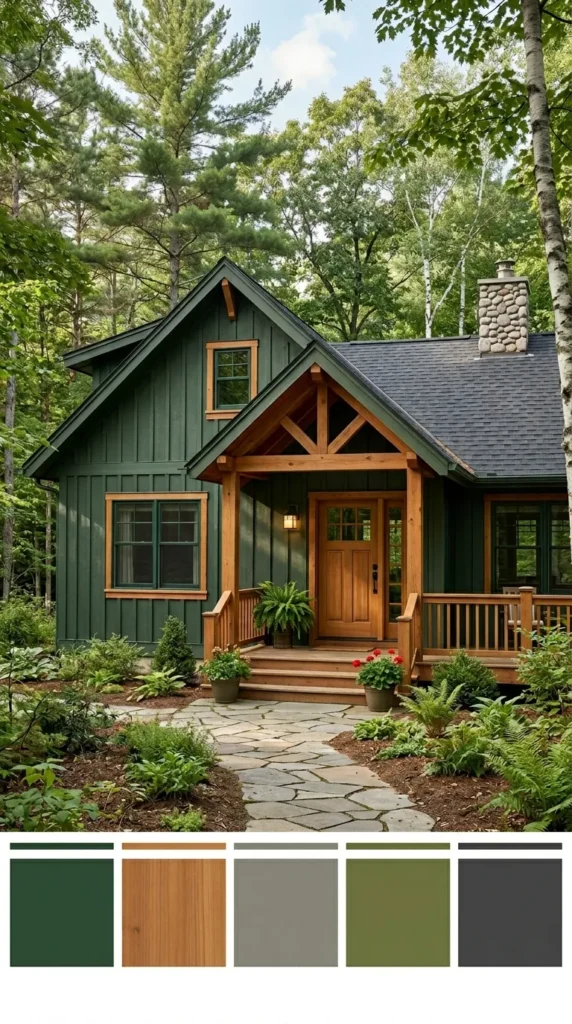
I have always felt that a house should look like it belongs among the trees. Painting your home a deep forest green helps it blend into the landscape beautifully. When you add natural wood accents, like a cedar door or porch pillars, the whole look feels very grounded.
It reminds me of a cozy cabin hidden in the woods. This combination is perfect if you love a rustic and peaceful vibe. It feels strong, timeless, and very connected to the outdoors.
Midnight Blue with Warm Wood Tones
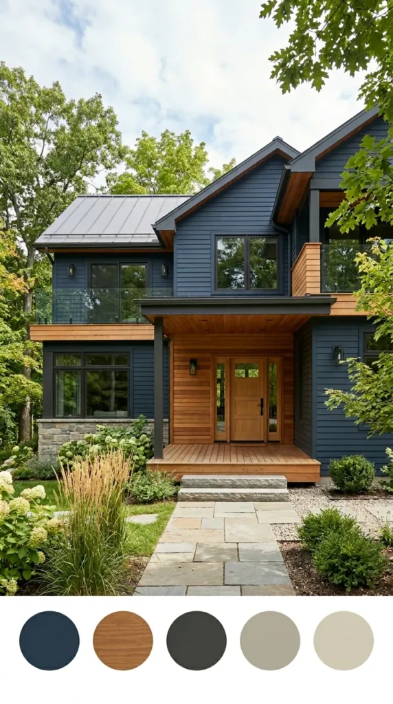
There is something so sophisticated about a very dark blue house. I love how a midnight shade looks when the sun hits it just right. To keep it from feeling too cold, I like to use warm wood for the front door or the window frames.
The contrast between the deep paint and the natural grain of the wood is stunning. It makes a bold statement without being too loud. It feels modern, private, and very high-end for any neighborhood.
Cheerful Yellow with White Trim
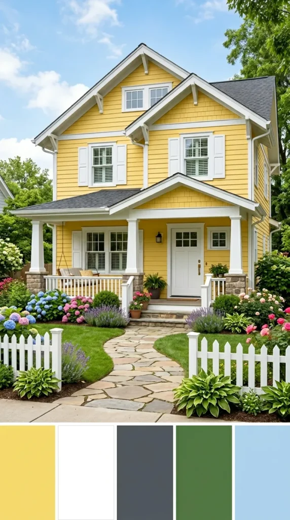
A yellow house always looks like it is smiling at the street. I find that a soft, sunny yellow makes the entire yard look brighter and more inviting. When you pair it with crisp white trim, the house looks clean and very classic.
It is a wonderful choice for a large family home because it feels so happy and friendly. Every time you pull into the driveway, it feels like a warm hug. It is a great way to spread some joy to your neighbors.
Muted Sage Green with Off-White Trim
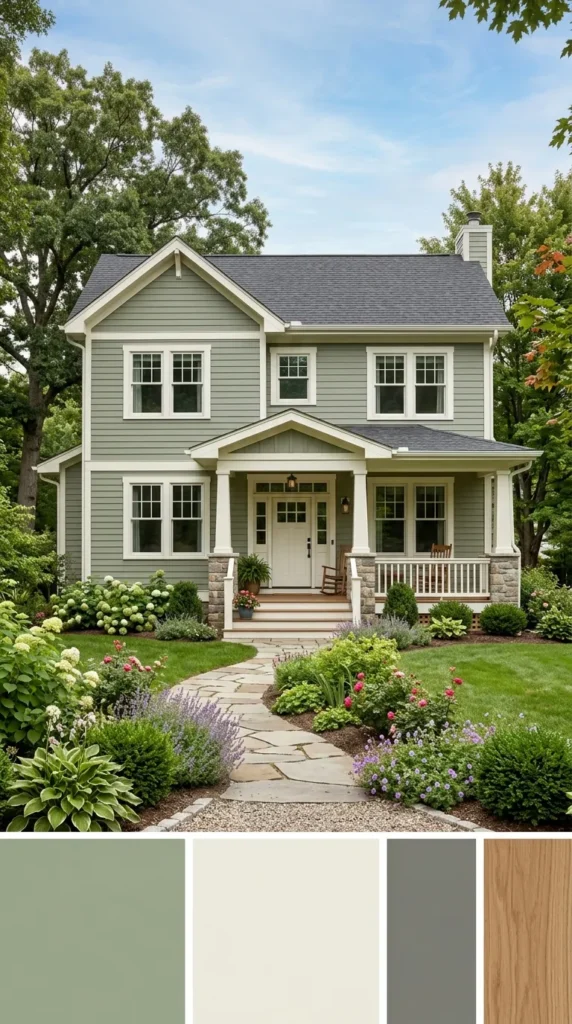
Sage green is one of my favorite colors because it is so calming to look at. It is a very gentle shade that looks wonderful in any light. Using an off-white trim instead of a bright white keeps the look soft and traditional.
It feels very fresh and clean without being too stark. This palette works beautifully if you have a lot of flowers or bushes in your front yard. It creates a very peaceful and balanced look for your home.
Bold Charcoal Blue and Crisp White
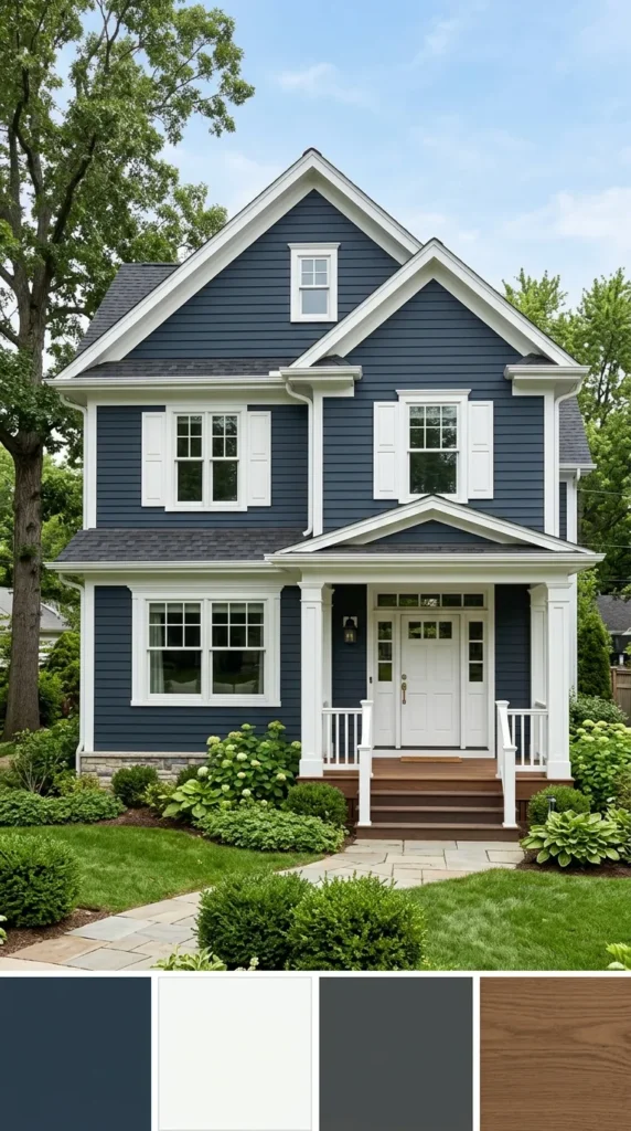
If you want your home to stand out, charcoal blue is a fantastic choice. It is a very deep, moody color that looks incredibly sharp against bright white trim. I think it gives a house a very strong and sturdy personality.
The white accents really pop against the dark background, highlighting the shape of your windows and doors. It is a very popular look right now because it feels fresh and updated. It gives your home a lot of character and style.
Earthy Clay and Warm Taupe
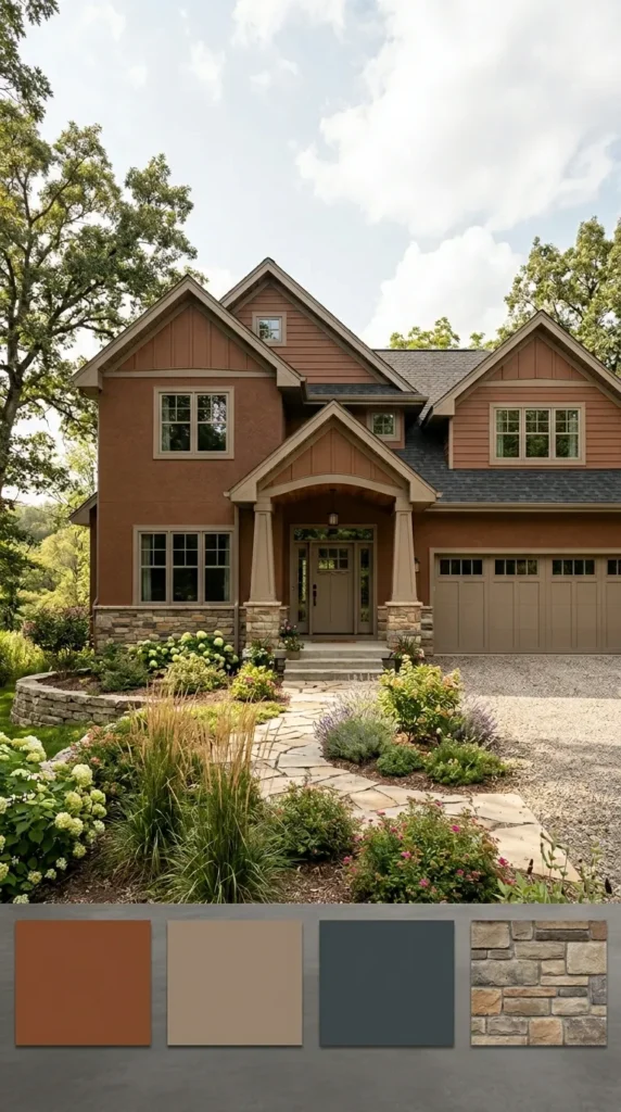
I love colors that feel like they come straight from the earth. A warm clay color on the walls feels very solid and welcoming. When you use a warm taupe for the trim, the whole house looks very harmonious and soft.
It is a great choice if you want a look that is interesting but not too bright. This palette feels very relaxed and comfortable. It works perfectly for a home that is meant for gathering and making memories.
Olive Green and Warm Beige
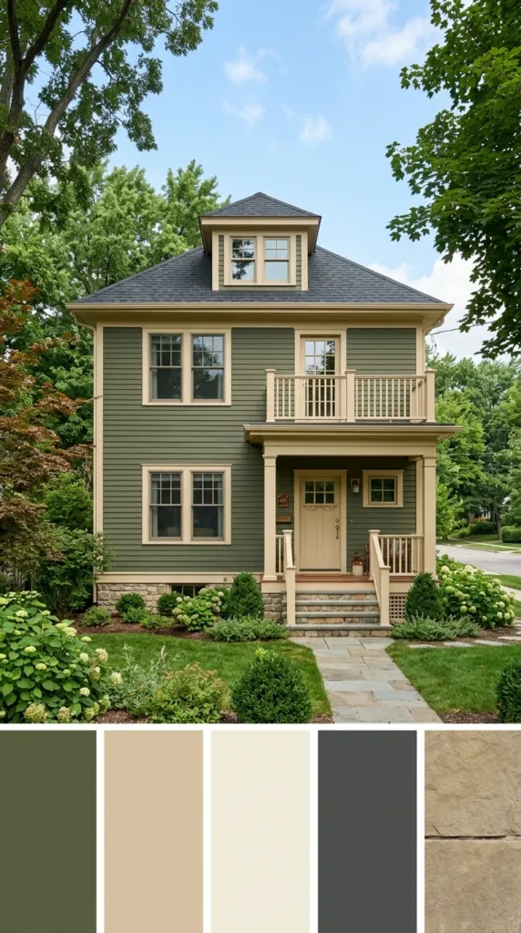
Olive green is a classic choice that never seems to go out of style. I think it looks very rich and elegant, especially on older homes with a lot of detail. Pairing it with a warm beige trim keeps the look feeling light and approachable.
It is a very sophisticated combination that feels very high-quality. The green is dark enough to hide a bit of dust, which is very practical. It makes your home look established and very well-loved.
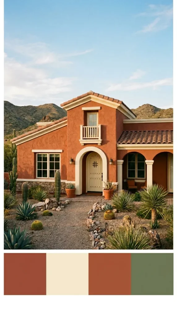
Warm Terracotta with Beige Trim
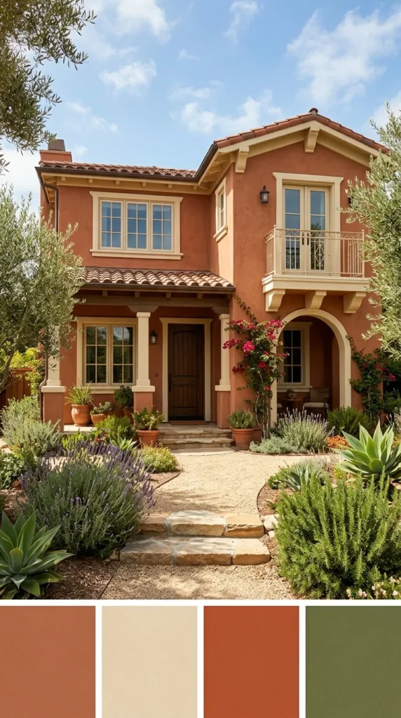
Terracotta always makes me think of beautiful sunsets and warm weather. It is a very bold and energetic color that brings a lot of life to a street. Using a beige trim helps to soften the look so it is not too overwhelming.
It feels very Mediterranean and sunny, even on a cloudy day. This is a great way to make your home feel unique and full of warmth. It is a color that definitely makes a lasting impression.
Deep Brown with Cream Accents
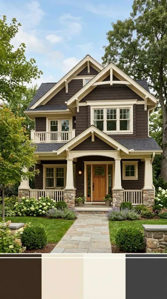
A dark brown house can look incredibly cozy and chocolatey. I find that using cream accents instead of white makes the house feel much more traditional and soft. It is a very grounding color that makes a home feel like a safe retreat.
The cream trim provides just enough contrast to show off the house’s features. It looks wonderful with stone walkways or a brick chimney. It is a very sturdy and reliable look for a family home.
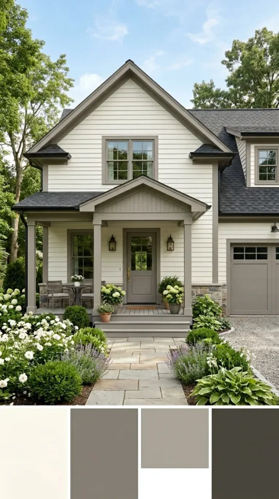
Soft Warm White with Greige Accents
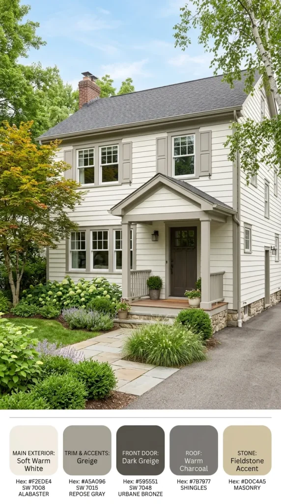
You can never go wrong with a white house, but I like to use a warm white to keep it from looking too cold. Adding greige accents—which is a mix of gray and beige—adds a bit of modern style. It is a very clean and bright look that feels very current.
It makes the house look large and very airy. This palette is like a blank canvas that lets your landscaping and front door stand out. It is a very safe and beautiful choice.
Cool Pewter with Crisp White Accents
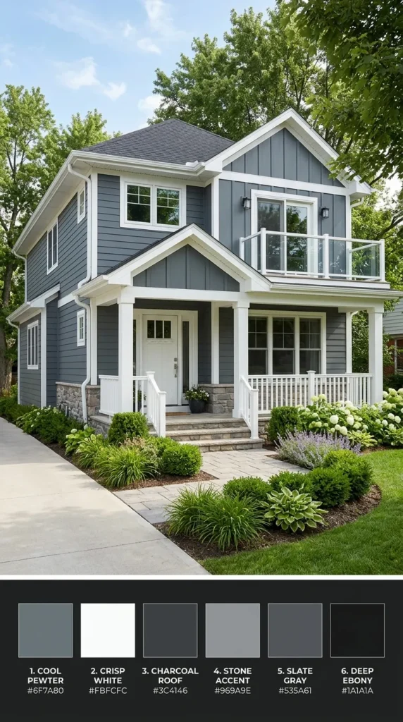
Pewter is a beautiful, medium gray that has a very calm and cool feeling. I love how it looks with a bright, crisp white on the railings and window frames. It feels very professional and tidy, which is great for curb appeal.
It is a very versatile color that looks good in almost any climate. The gray is dark enough to provide contrast but light enough to stay cool in the sun. It is a very smart and modern choice.
Desert Terracotta and Cream
This combination reminds me of the beautiful homes in the southwest. The terracotta is a bit lighter and more sandy, which feels very natural. When you add cream trim, the house looks very bright and sun-kissed.
It is a great way to add color without being too dark. It feels very open and friendly to guests. This palette is perfect for a home that gets a lot of direct sunlight throughout the day.
Creamy White with Warm Gray
If you want a very soft and elegant look, creamy white is the way to go. It is much gentler than a pure white and feels very expensive. Using a warm gray for the shutters or the trim adds a bit of depth without being too harsh.
It is a very understated look that shows a lot of taste. The house will look clean and very well-maintained. It is a timeless choice that you will love for many years to come.
Dark Leafy Green with Beige Accents
A very dark green can look almost black in the shade, but it glows beautifully in the sun. I love how it makes a house look tucked away and private. Using beige accents helps to lift the color and make it feel more approachable.
It is a very bold and dramatic choice that feels very high-end. It looks amazing with black hardware and a wood front door. It is a great way to give your home a very distinct and strong look.
Warm Gray with Putty Tones
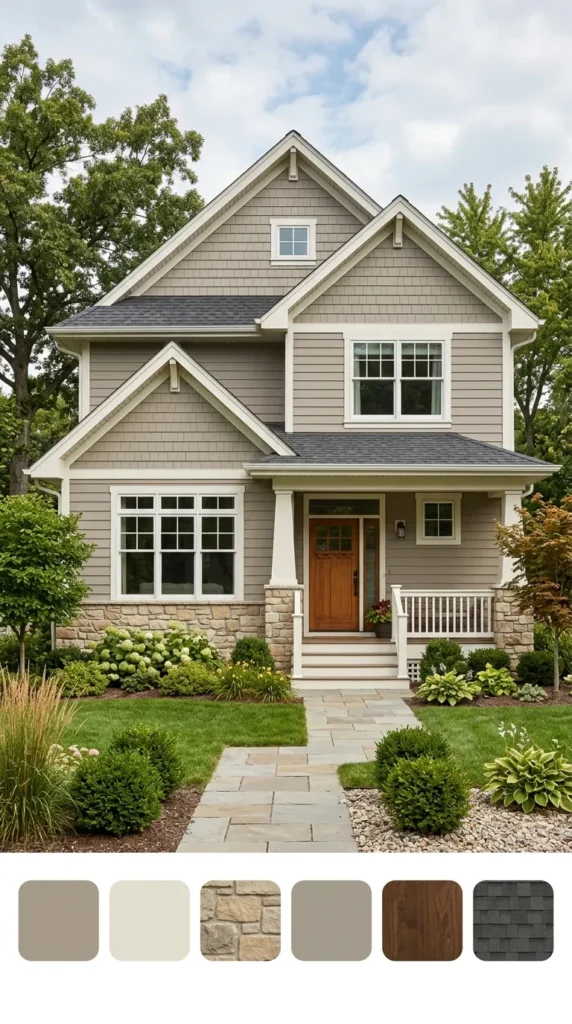
Gray does not have to be boring if you choose a shade with warm undertones. I like mixing it with putty tones, which are soft and earthy. This creates a very layered and interesting look that is very easy on the eyes.
It feels very neutral and calm, making it a great backdrop for a colorful garden. This palette is very modern and works well on many different styles of homes. It is a simple way to make your house look updated and fresh.